
Dell Medical School | Project iCare
Summary
Team
Diana Mendoza (UX Designer, Graduate Assistant)
Erin Finley (UX Designer, Graduate Assistant)
Sara Merrifield (UX Researcher, Graduate Assistant)
Eric Nordquist (Clinical Associate Professor and UX Supervisor)
Kasey Claborn (Assistant Professor and Project Lead, Department of Psychiatry)
Avani Jhaveri (Clinical and Behavioral Research Associate, Department of Psychiatry)
Problem statement
The current state of the U.S. healthcare system is very fragmented and leaves the patient as the sole ‘point-of-truth’, responsible for carrying all the burden of information from one doctor to the next.
This is known as an acute care model.
Dr. Kasey Claborn and Avani Jhaveri from the Dell Medical School explained that they were in the last year of a grant they had received and had used most of the grant money to build the system already. Unfortunately, their app did not test well with clinics and clinicians were hesitant to use it.
Solution
Over the course of three months, we worked with Dell Medical to design a web application to shift the burden of information knowledge from relying solely on the patient to instead being distributed digitally across the entire ‘care team.’ This provides a more holistic view of care, also known as chronic care, to the providers which in turn allows them to treat from a more holistic viewpoint with visibility into what all members of the care team are providing.
To ensure that clinicians would want to adopt the system once the pilot was released, we adopted an interative design approach, using feedback from ongoing user tests to inform the final designs.
Process
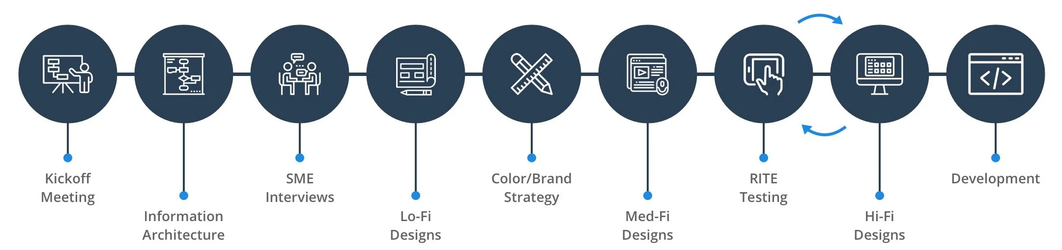
Determining the information architecture
Initial mockups
We sketched out a rudimentary information architecture at the kickoff meeting to ensure that we were on the same page as the Dell Medical team. Using this IA, I created the initial low-fidelity mockups to present back to the Dell Medical team and start gaining feedback from them.

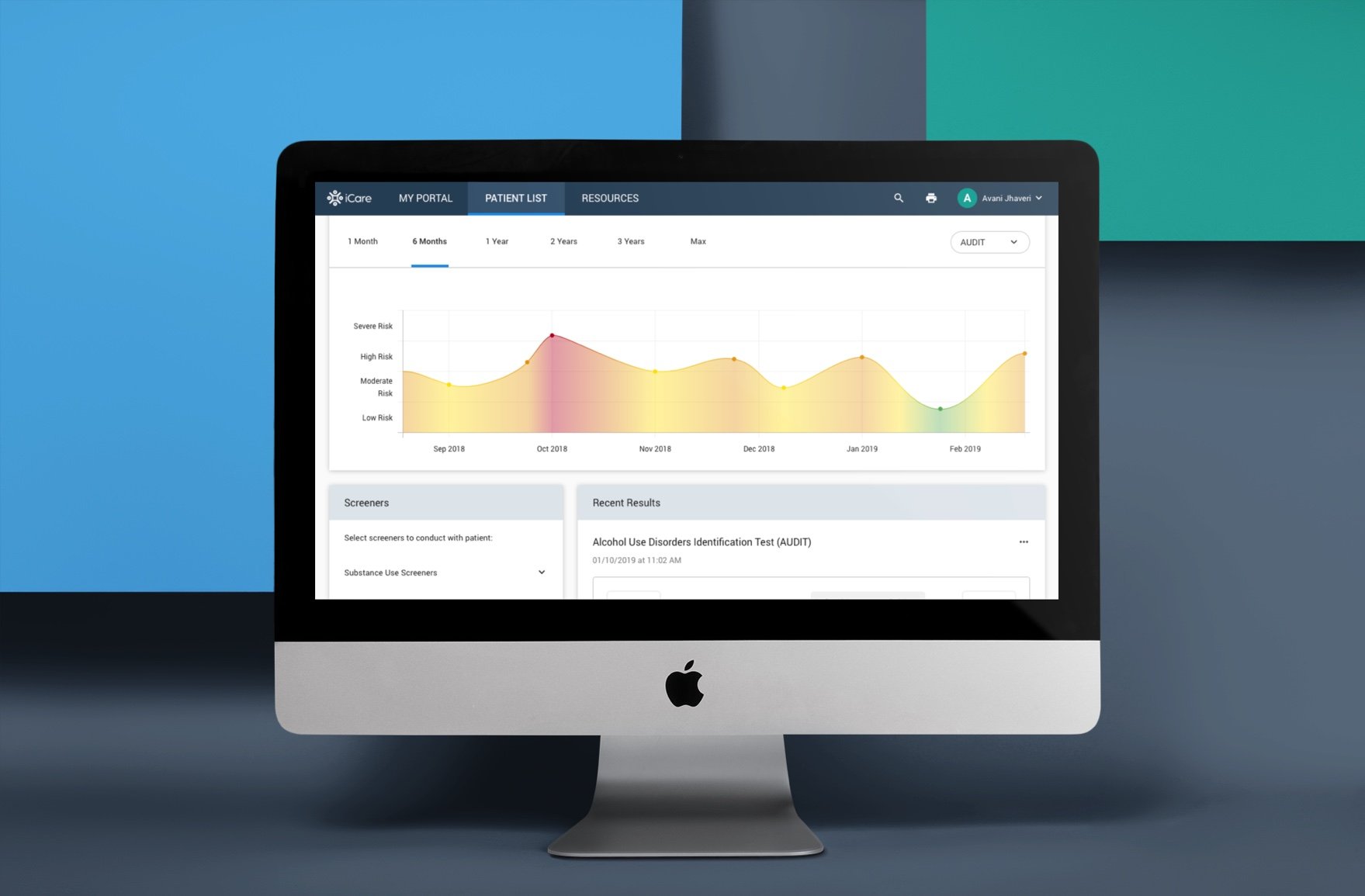
My Portal (dashboard)
Screener process
Patient dashboard with screener results
Patient referralInformation architecture
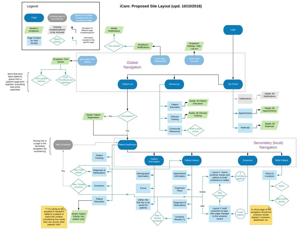
After receiving more information about the extent of the features that the app would include, a second designer (Erin) was brought on to help with the UX. Additionally, we looped in the UX researcher (Sara) as a regular participant in the design meetings. To help communicate the complexity of the app's feature set as well as document any changes to the information architecture, I created a diagram of the proposed site layout as a reference.
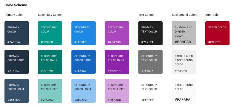
Brand and visual identity
Developing a design system
When the time came to create a design system to use for the high-fidelity final designs, Erin Finley took the lead and created the bulk of the framework such as button stylings, best practices for color usage, typography, icons, navigation elements, and more.
However, it was at this time that the Dell Med research team secured a grant that required us to adapt from a laptop application to a tablet. I then took the point on reviewing our design system to redesign our components to be more mobile-friendly, such as the filters, pagination, and the progress bar for the screen pages. I also added more components as needed, such as a banner notification, a dropdown row for the Referrals screen, and a few icons pulled from Material Design.
Original pagination design
New mobile-friendly pagination component
Original filter design
New mobile-friendly filter design
Refinement of design
RITE testing
Users were asked to complete two task-based scenarios using the prototype, which received average scores of 4.75/5 on a Likert Scale (1: Very Difficult, 5: Very Easy):
Task 1: You have a new patient named Theodore Abernathy that has come in for an appointment. You need to administer 4 screeners to Theodore and then refer him based on the results of the screener.
Task 2: Click on the iCare logo in the upper left-hand corner to return to your portal. You have an existing patient named Monica Picard and it’s been a while since you’ve last seen her. Go to her file in the iCare system to find more information on her.
To view a PDF of user feedback from the RITE testing, click here.
Overall, the usability tests showed that clinicians were interested in the app, which was a major change from the original app the Dell Med team had before our design.
Final design
My Portal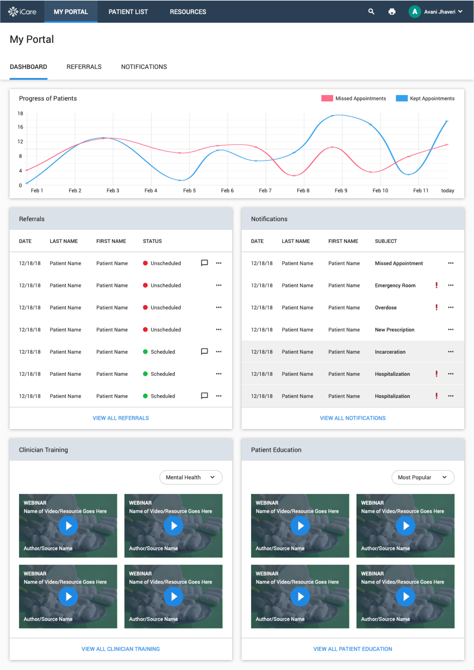
Patient Dashboard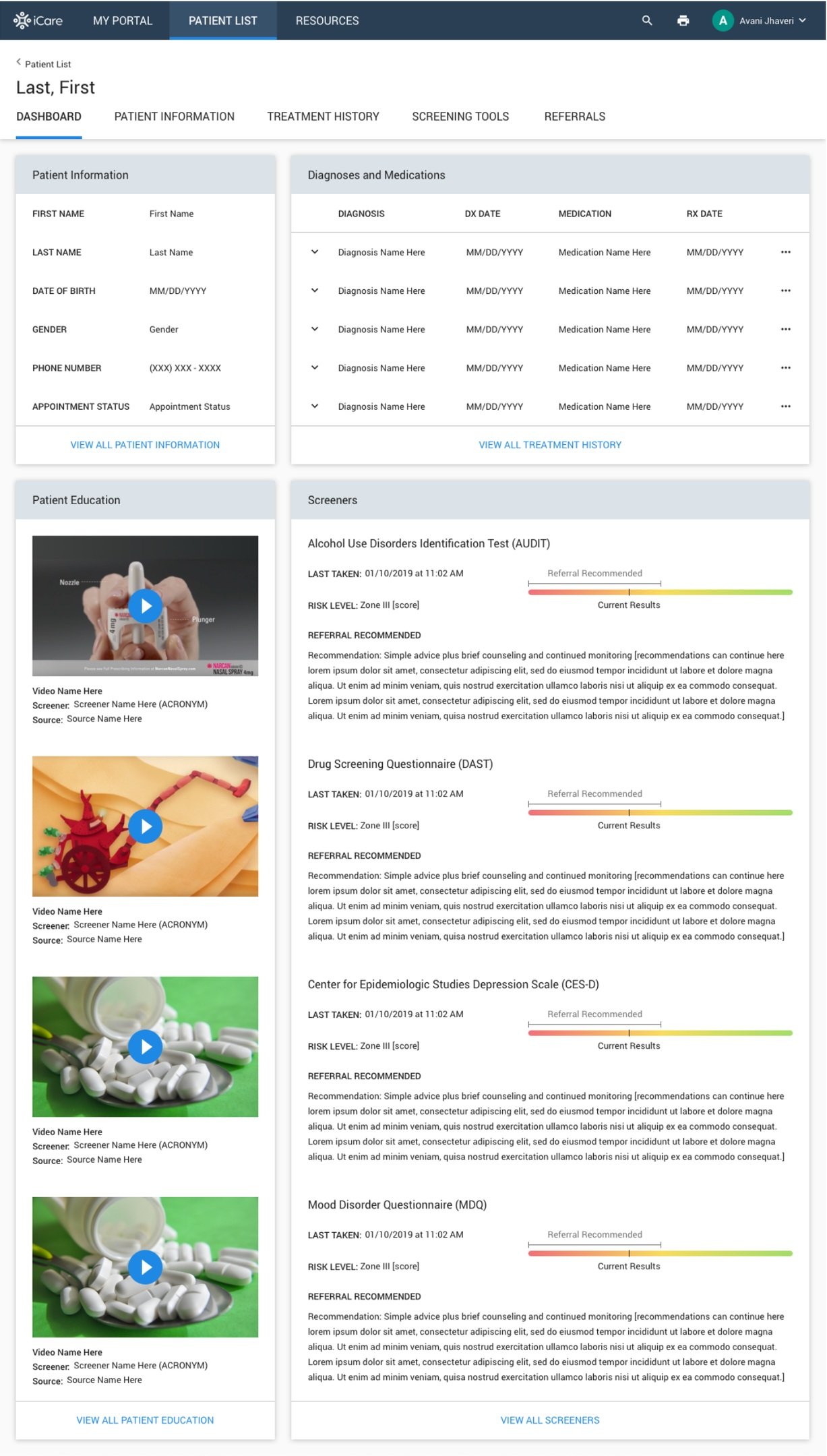
Patient Information and Add New Diagnosis/Rx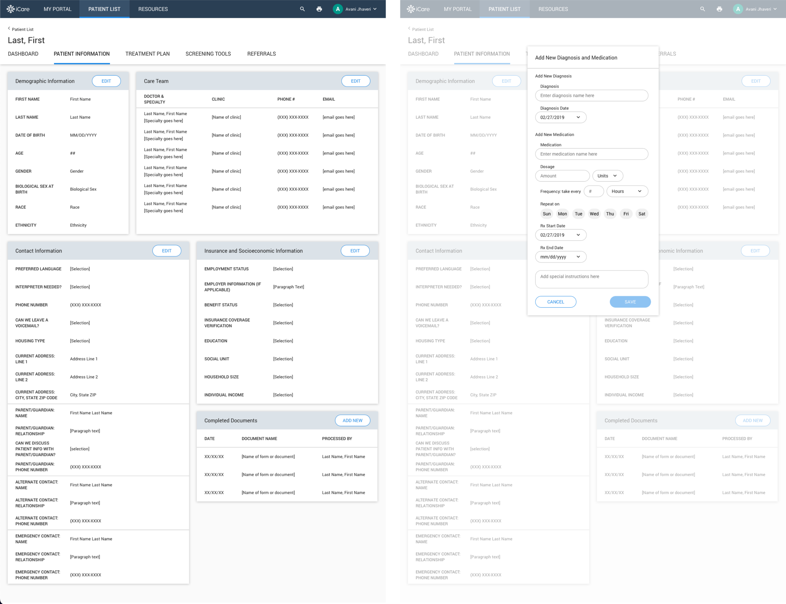
Screener Process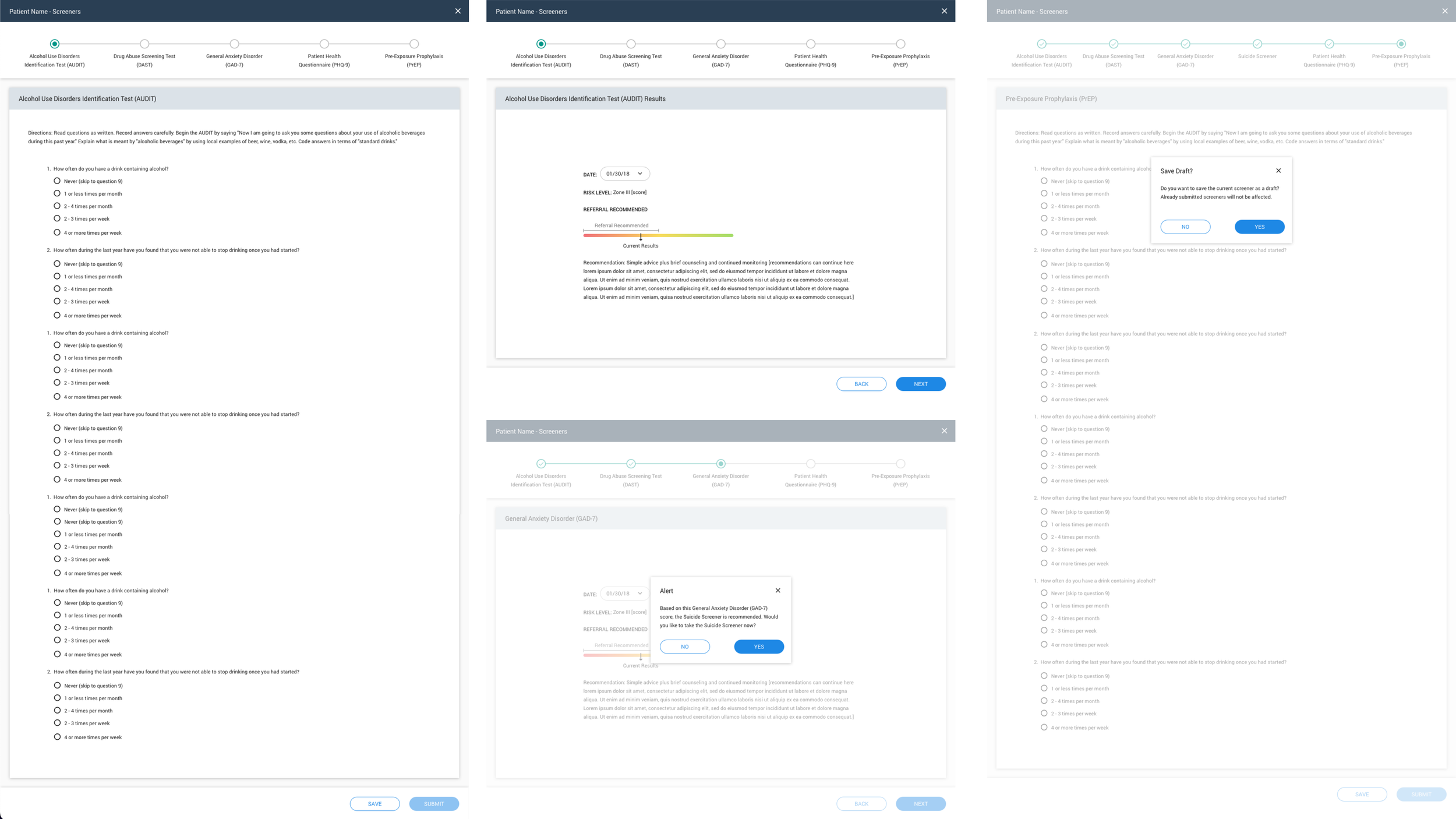
Patient Treatment History
Impact
During testing, several participants commented on how they liked iCare more than their EHR system. The Dell Medical team had already thought that the new design of the application had the potential for use beyond mental health and substance misuse treatment, and such feedback validated the idea. The potential for impact was also recognized by the Texas Targeted Opioid Response (TTOR) Grant Program, which soon awarded the team an additional multi-year $2 million grant in early 2019 to continue the project.
You can read more about this project by viewing this article.